Google
De-mystifying AI for complex, data-heavy interactions.
Google LLC is an American multinational technology company that specializes in Internet-related services and products, which include a search engine, online advertising technologies, cloud computing, software, and hardware.
Challenge
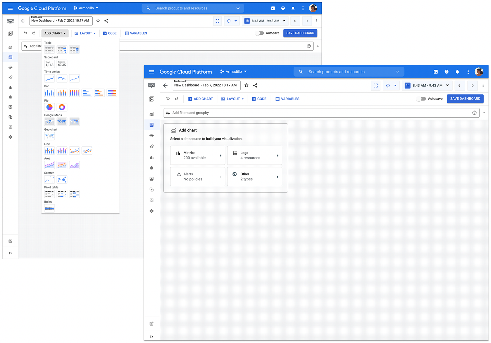
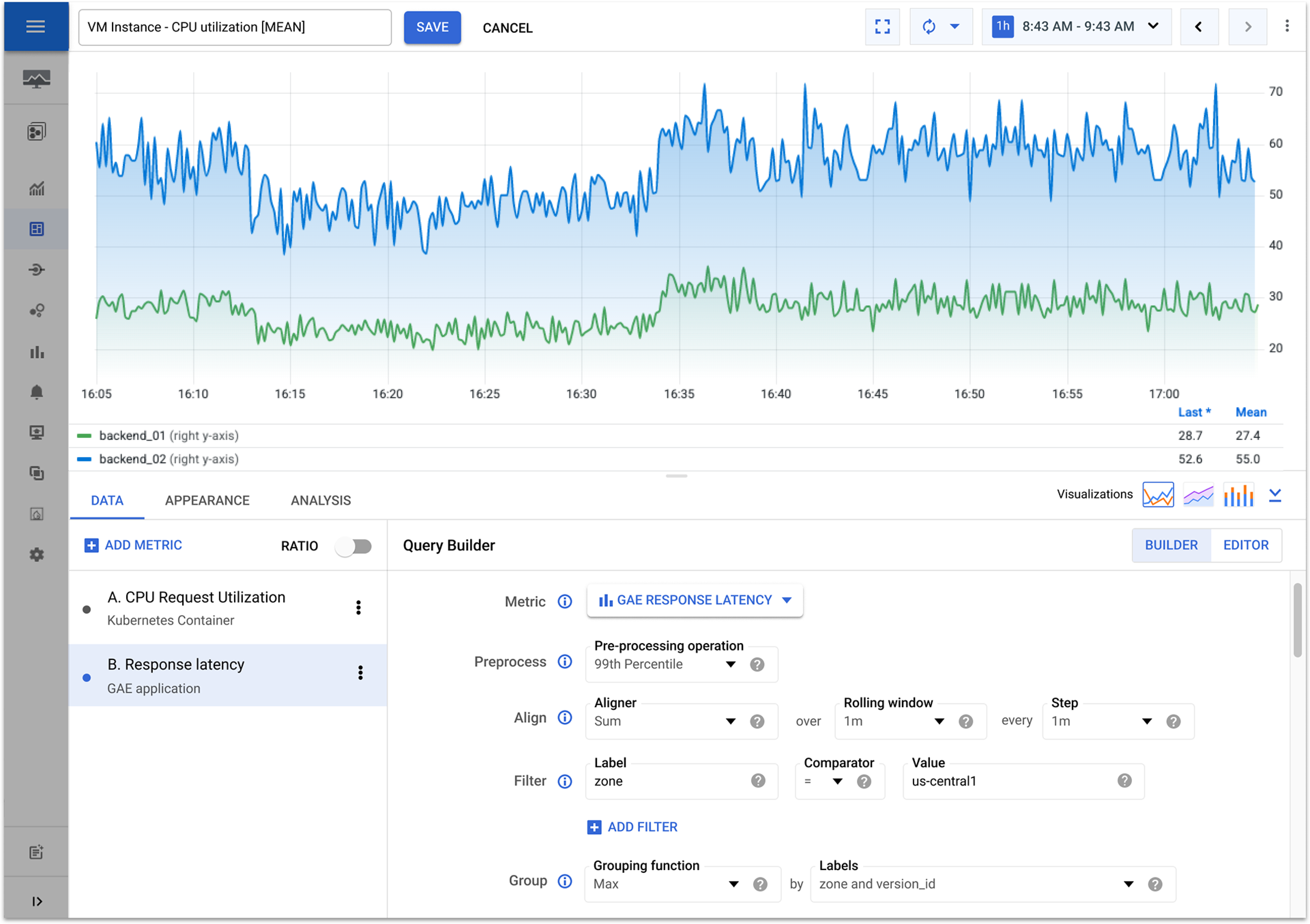
The Google Cloud monitoring product serves a wide variety of personas ranging between highly technical coders to lower tech analysts. The product needs to be rich with features that are customizable yet easy to use. Since the new feature additions have grown rapidly, some of the UX best practices rules now need a holistic overhaul which means we are lifting multiple dependent features at once. The existing interface configures source data, charts and dashboards simultaneously creating more levels of complexity.
Process
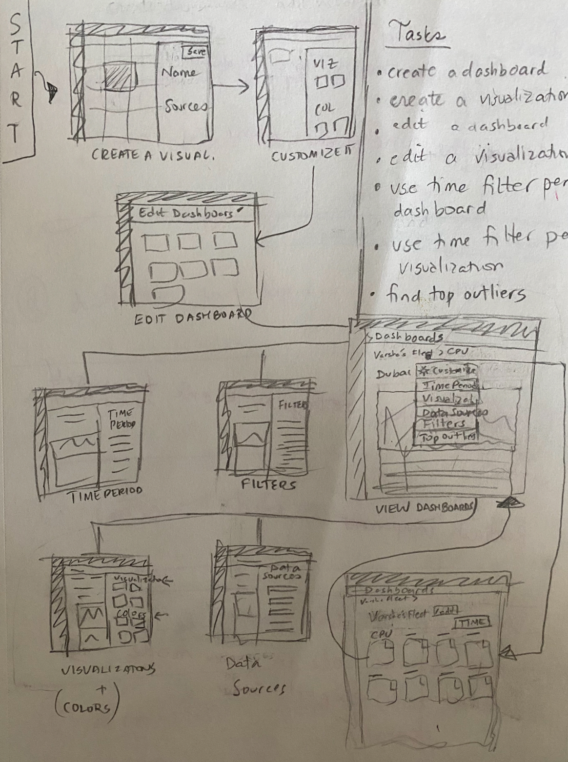
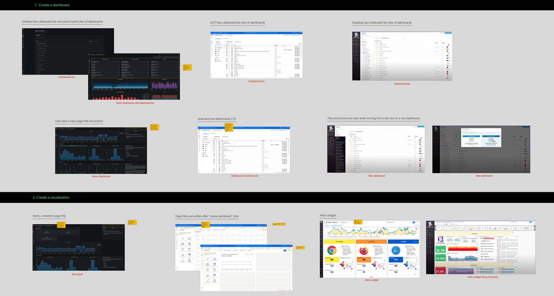
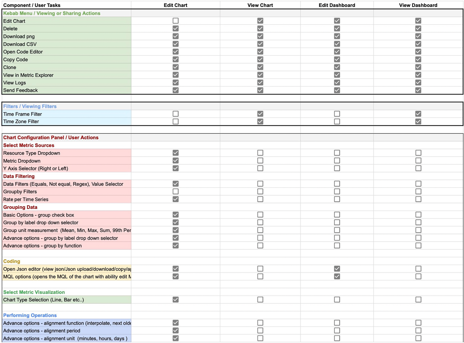
We started out with competitive research by fine combing through micro interactions available on Grafana and Datadog. We focused on the creation and visualization of charts since we knew that this area needs the greatest over haul. We then created keyframes working hand in hand with our user research team to better understand the mental model for users configuring a new chart. In addition to working with user research, we also created multiple feature information architecture clusters to ensure that feature types and components were consistent and easy to find.
Competitive Research
Feature Audit
User Testing
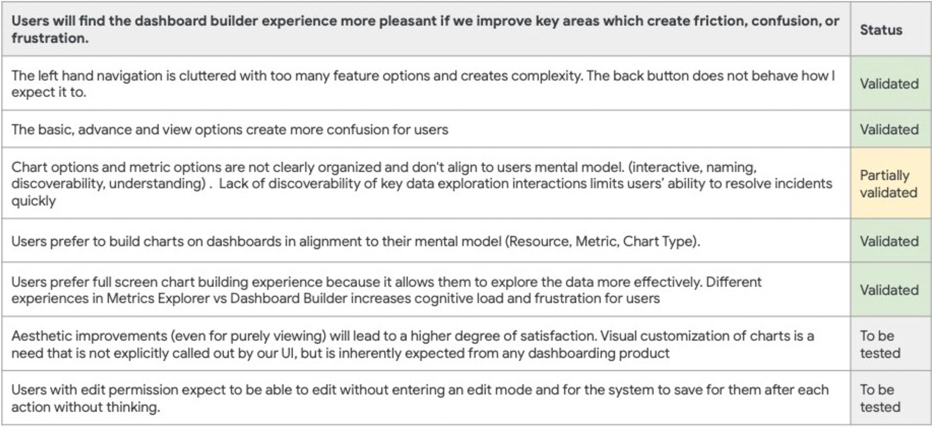
A/B Testing
Recommendations
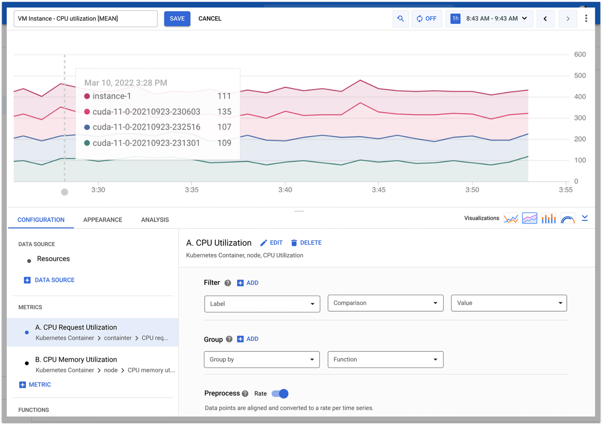
Visually separate out the experience of setting up a dashboard and setting up a chart. When possible, cluster like functioning actions and components together. Keep the code editor visible and also clear when on the dashboard verses the chart level. Add a new option to allow users to add a chart through data type and not only by visualization type.
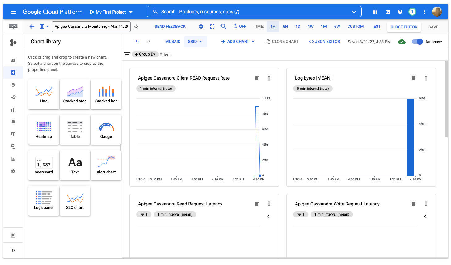
Outcome to Launch
We revamped the tool bars and several of the components. We also created a full screen single chart configuration option. I worked hand in hand with our Lead Engineer to ensure that the new data setup and editing configurations are intuitive and cohesive. Our next steps included more user research, prototyping edge cases, and exploring how our code editors will evolve with the new designs.
Dashboard